.png)
The Biggest User Interface Upgrade in Years
The move from OS3 to X4 represents one of the largest visual redesigns in Control4 history.
While OS3 focused heavily on functionality, X4 introduces a cleaner and more modern smart home experience.
Major Changes Between OS3 and X4
FeatureOS3X4Interface StyleFunctionalModern minimalistNavigationMenu-heavyFaster swipe navigationPersonalizationLimitedExpanded customizationMobile ExperienceGoodMuch smootherFavoritesBasicDynamic dashboards
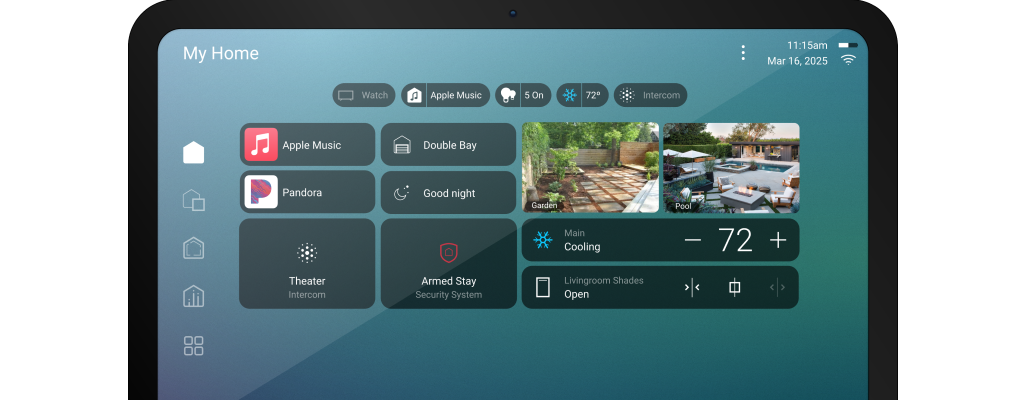
Improved Dashboard Layouts
X4 introduces:
- smarter room layouts
- customizable widgets
- quicker access to scenes
- more visual controls
Users can prioritize:
- lighting
- cameras
- music
- climate
- security
directly from the home dashboard.
Faster Navigation
One of the most noticeable improvements is speed.
X4 reduces the number of taps required for common actions like:
- turning off lights
- launching scenes
- adjusting music
- viewing cameras
This creates a much smoother user experience.
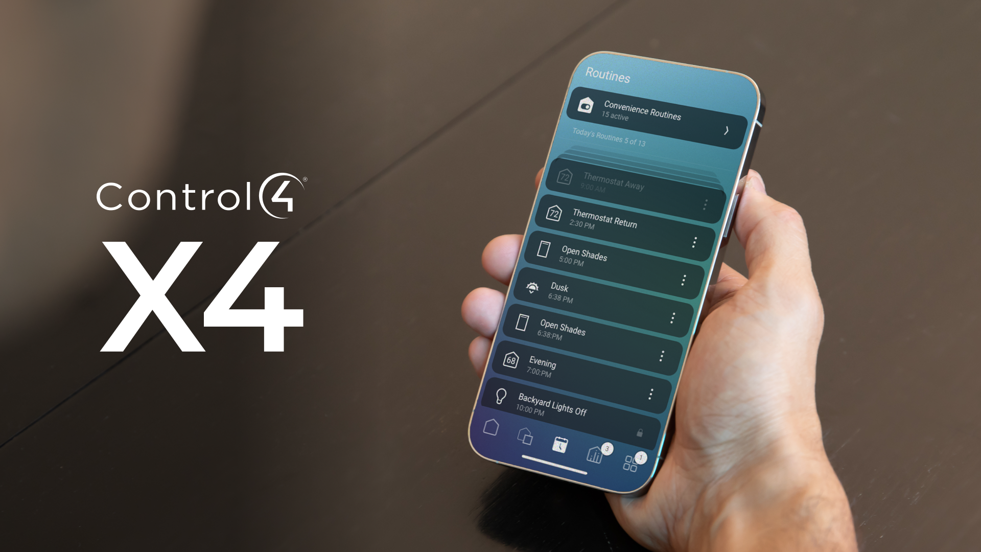
Better Mobile Experience
The X4 mobile app feels far more responsive and polished.
Improvements include:
- faster loading
- cleaner typography
- better dark mode support
- improved tablet layouts
- more intuitive controls
Enhanced Personalization
Homeowners can now customize:
- favorites
- room ordering
- quick actions
- dashboard shortcuts
This makes the system feel more tailored to daily routines.
What Existing Users Should Expect
Most users adapt quickly to X4 because the underlying Control4 logic remains familiar.
However, some long-time users may initially notice:
- relocated menus
- redesigned icons
- different navigation paths
After a few days, most homeowners find the new interface easier to use.
Final Thoughts
The transition from OS3 to X4 is less about changing how Control4 works and more about modernizing how homeowners interact with their smart home every day.
For many users, X4 feels faster, cleaner, and more premium.